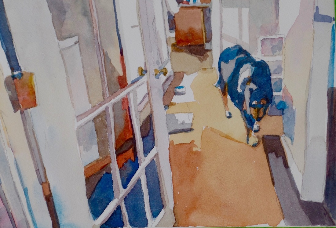
 This painting is all about neutrals. Neutrals are those colors that have no name. They are mixed by using the color wheel to combine opposite colors. The result is glorious mud colored pigment.
I think I captured the light in the hallway and my sweet Fig Newton dog as he strolled to the studio behind me. What I have learned so far : Neutrals are important to see as value shapes. You can use them to focus the attention on shapes that perhaps you don't want to emphasize but you need to include for the illusion of depth. I used to fear neutrals and now I embrace them and plan to use them in my peony attempts soon to come.
5 Comments
3/14/2017 05:56:07 am
You keep surprising me Jo, it is so "descriptive" (I think is the right word) 3/14/2017 05:59:47 pm
Thank you Steinunn, I am trying my hardest to find the essential parts of things. 3/14/2017 06:00:35 pm
Thanks Fay. I was surprised at how well it turned out. Sometimes things work out. 3/14/2017 06:08:40 pm
Hi Jo, this is such a great painting. I'm teaching perspective in a drawing class this month, and you've created a beautiful example of how it should be! And a beautiful painting. - Bobbi Your comment will be posted after it is approved.
Leave a Reply. |

About MeI am a watercolor coach, watercolorist, and author. 
Archives
September 2022
|